
MIT Tech Review
2023 – brand + systems + content
2023 – brand + systems + content
Key results
KPI: grow issue + newsletter subs
KPI: elevate homepage traffic
KPI: longer visit duration

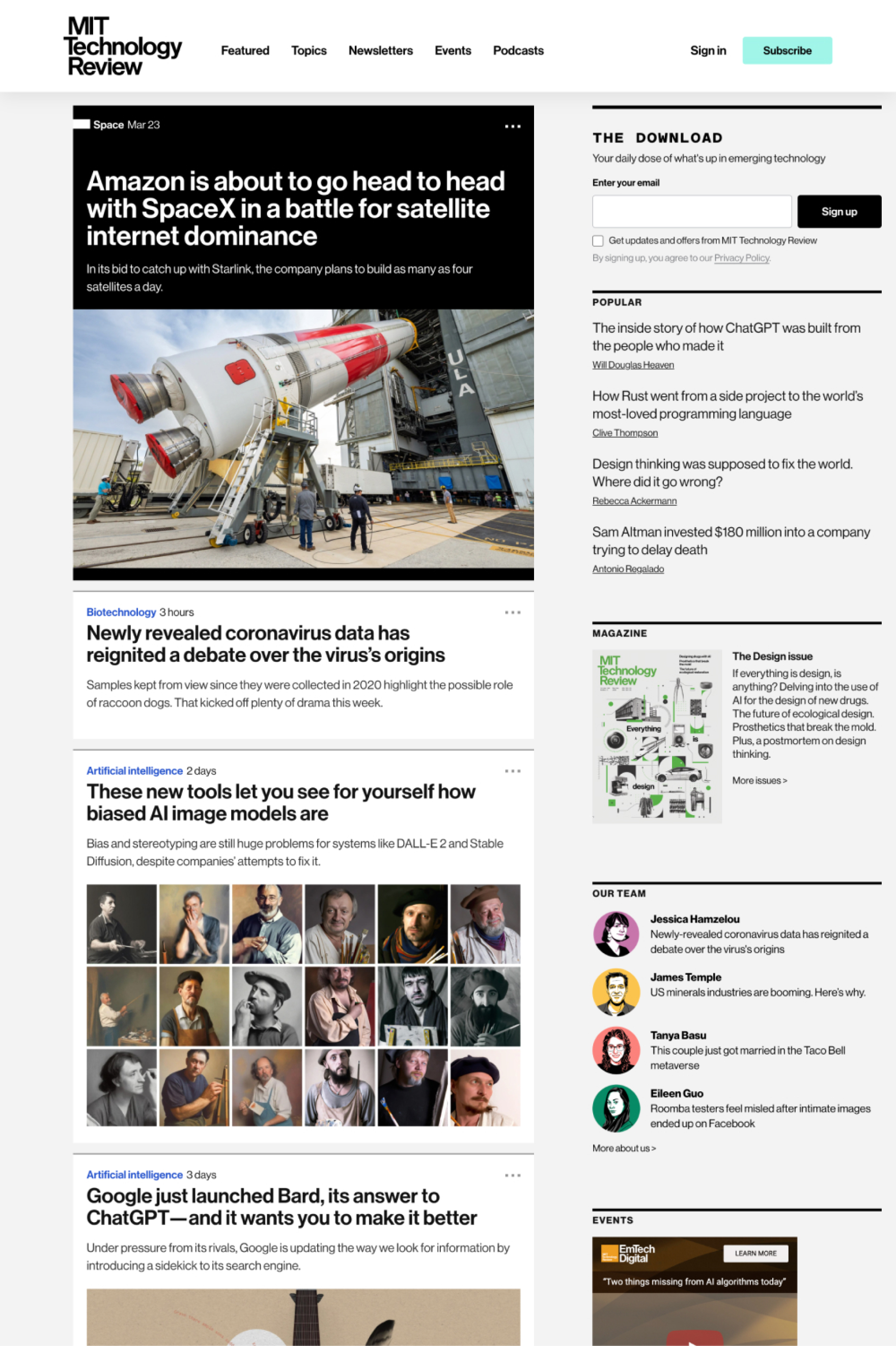
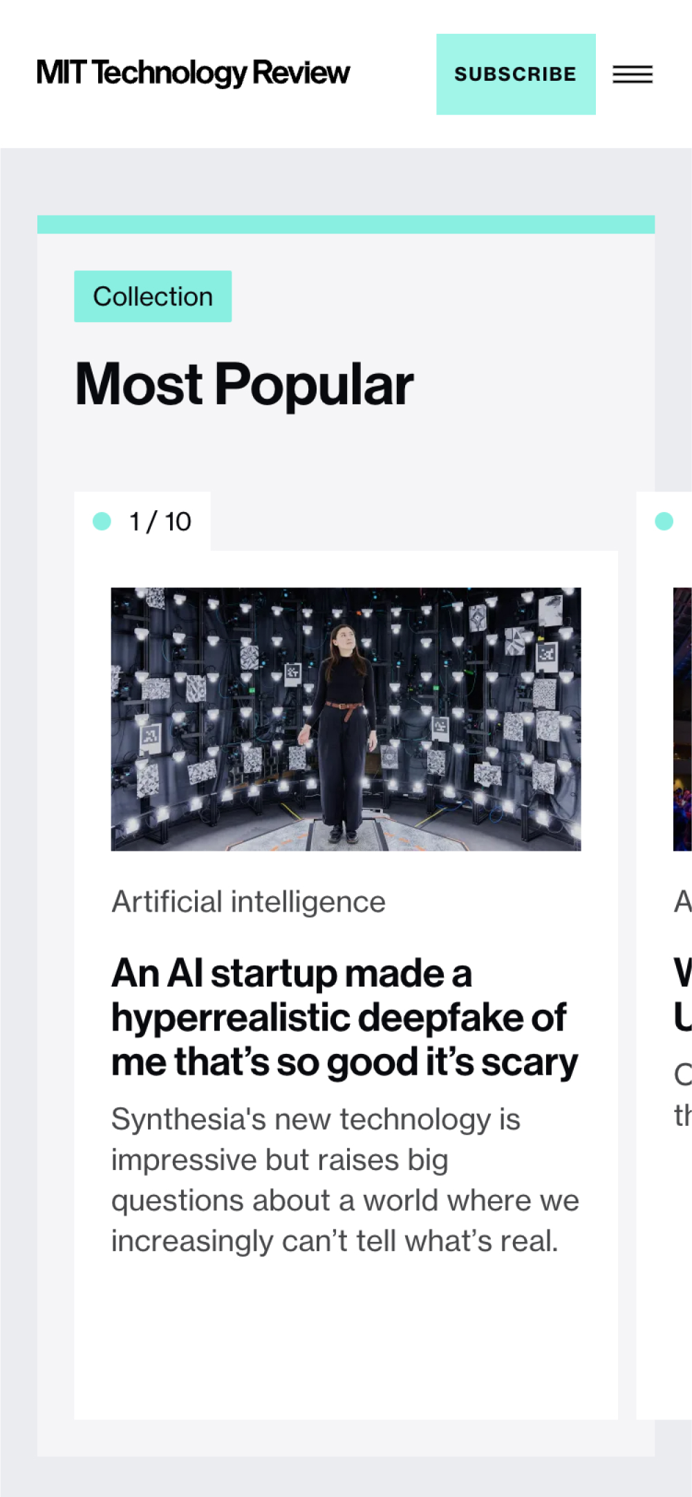
The fixed layout and reverse-chron feed meant stories got skipped and evergreen content was quickly buried.
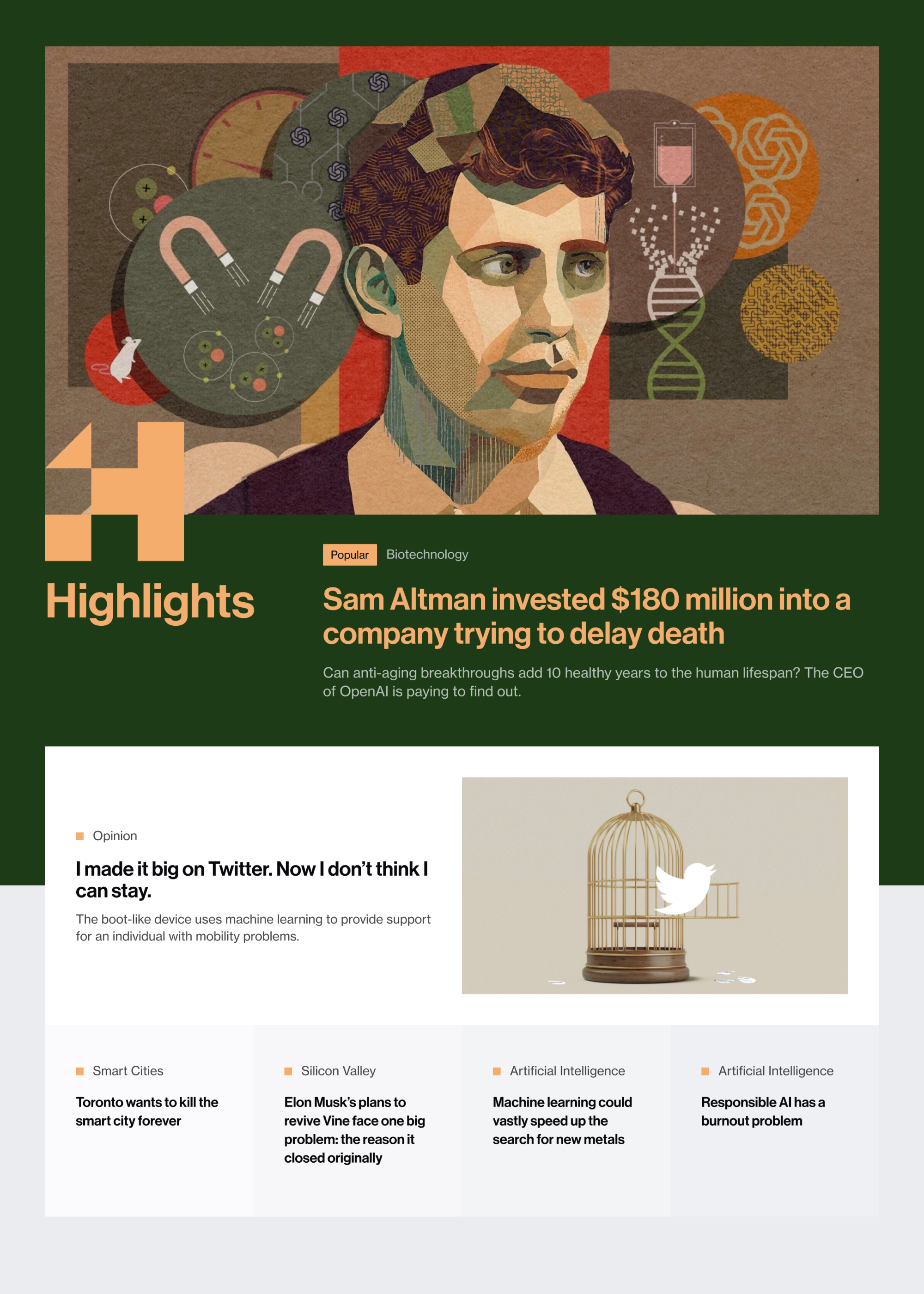
homepage

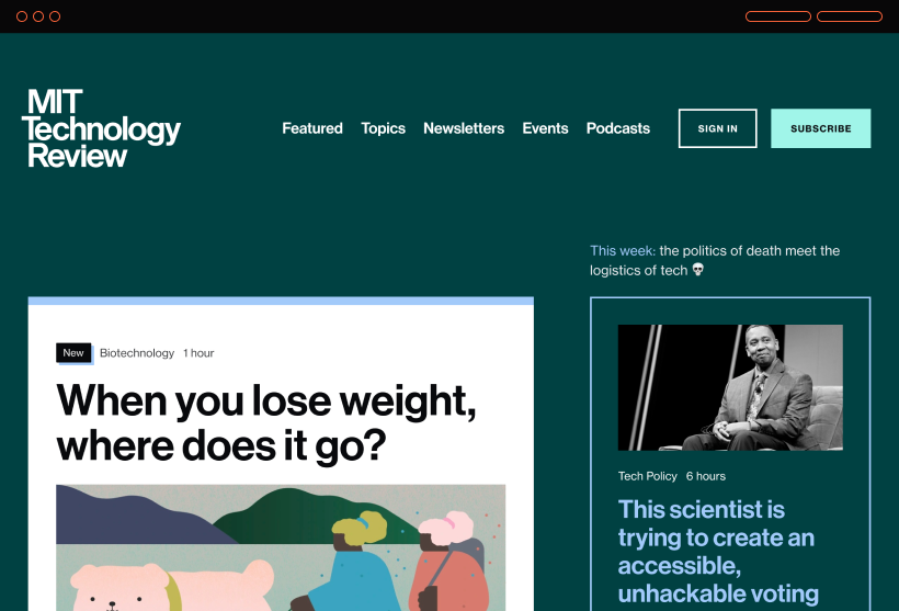
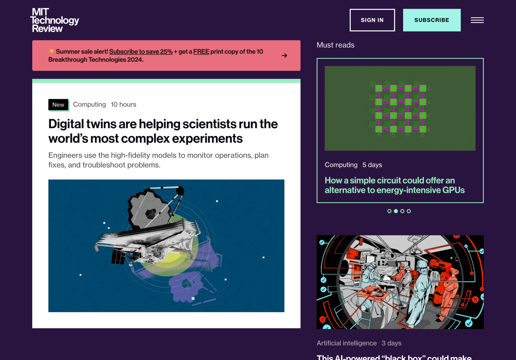
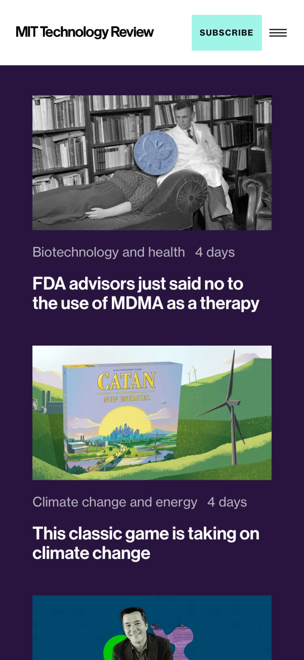
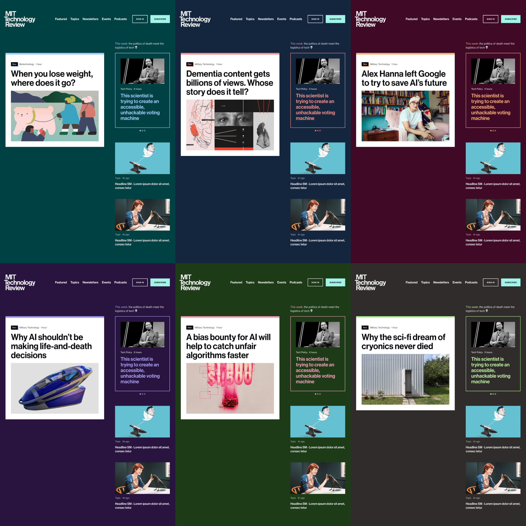
Flexible layouts, bold colors, and modular composition meant Tech Review was in control of their presentation.


Awards
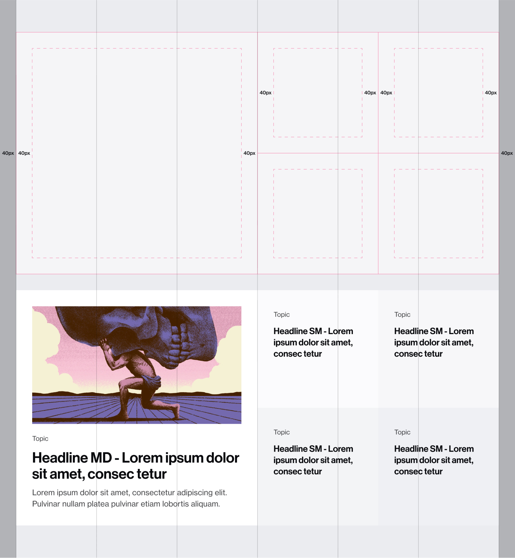
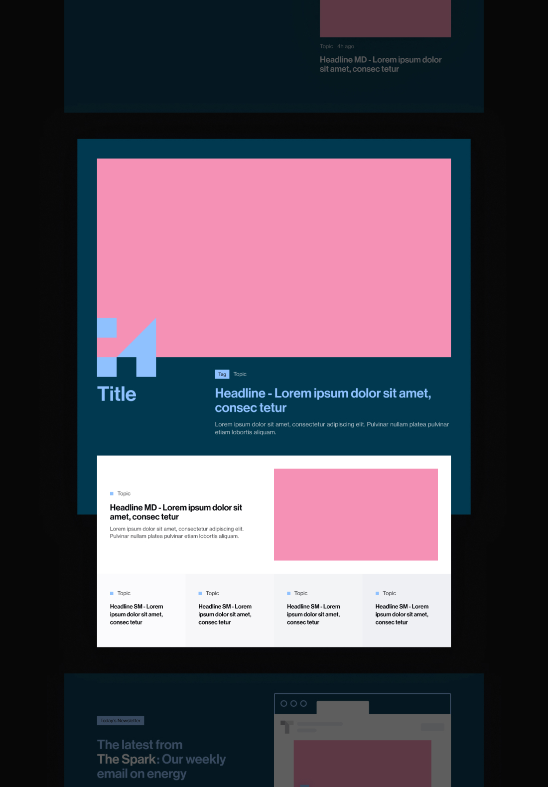
Instead a single monolithic layout, we introduced modular content blocks that snapped together seamlessly.
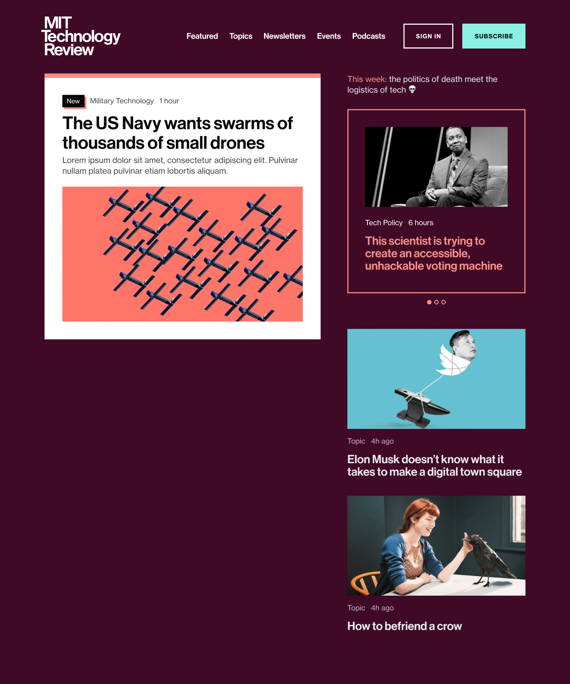
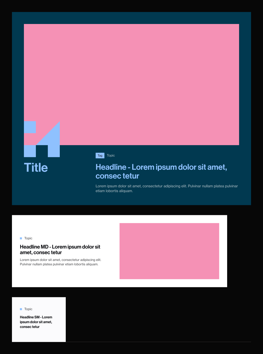
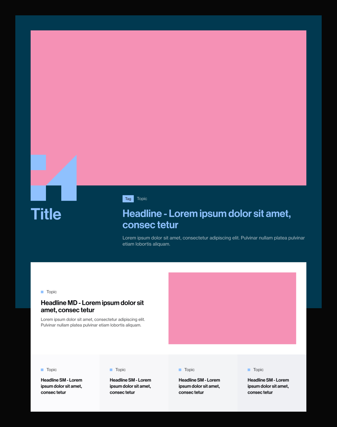
Hero
The first thing user sees. Flexible structure with ability to swap color and content day-by-day.
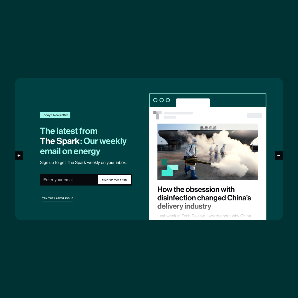
Newsletter
Generates clicks and keeps it fresh with rotating dynamic content.
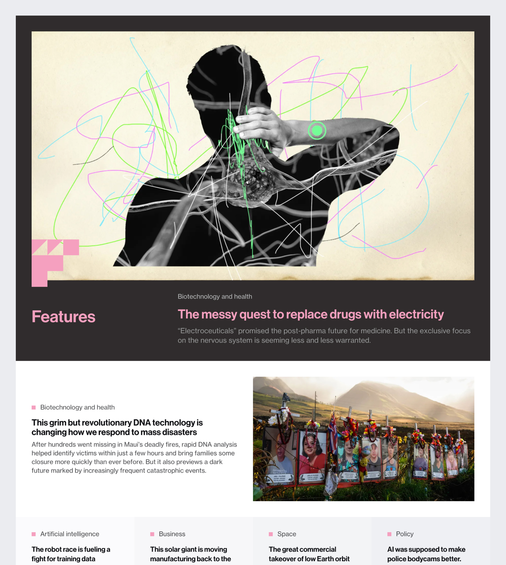
Story Group
Highly modular with low lift. Can be hand-curated, auto-generated, or timed to updated based on print schedule.
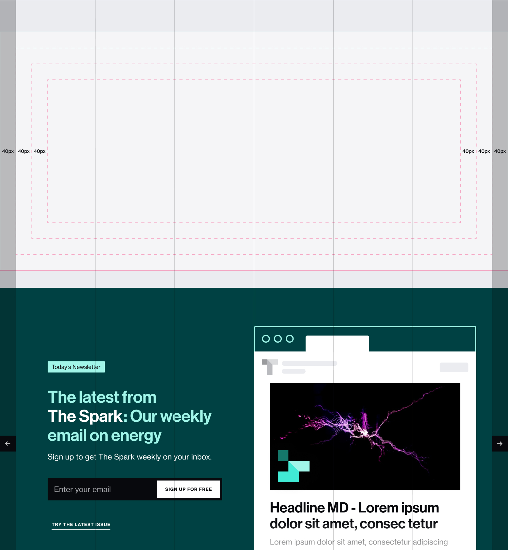
To make dynamic layouts possible, we introduced a grid system meant to appear complex but stay simple and lightweight under the hood.
1. Gutter-less outer grid
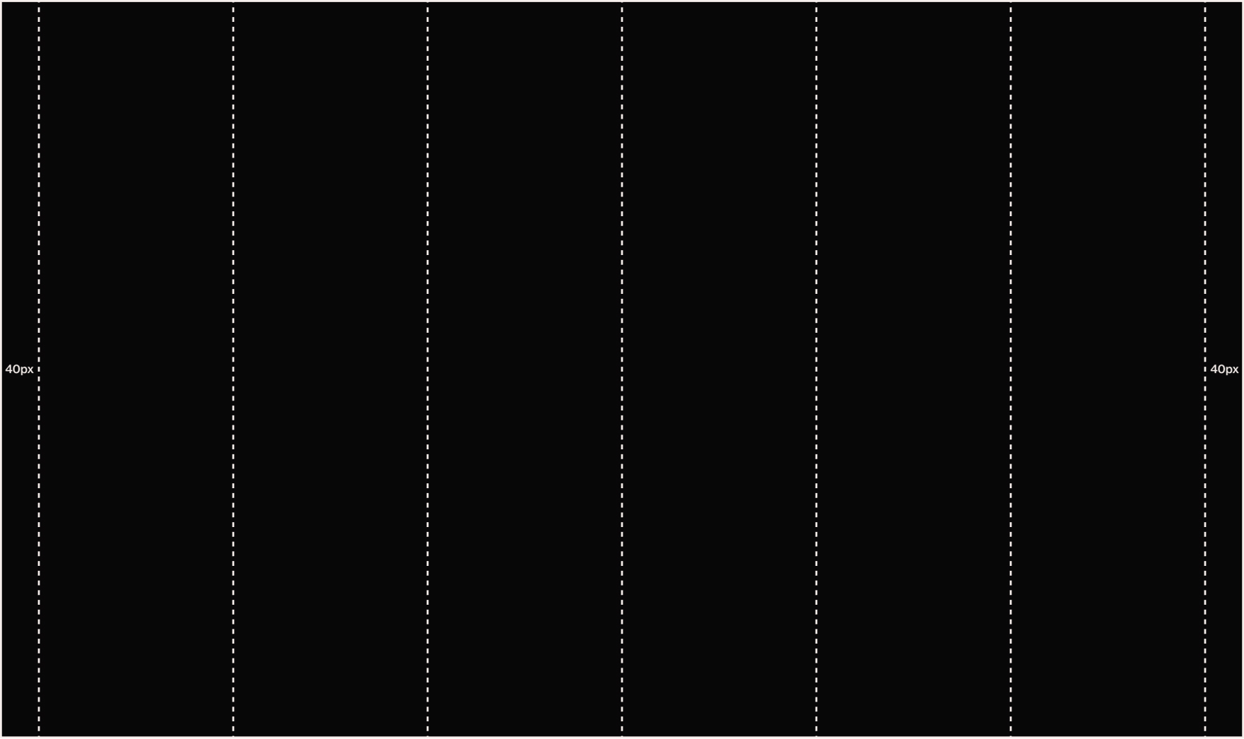
2. Flush cells w- internal padding
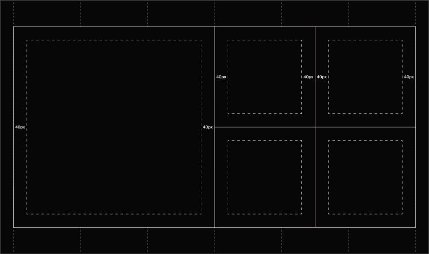
3. Filled cells with content
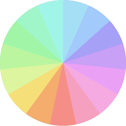
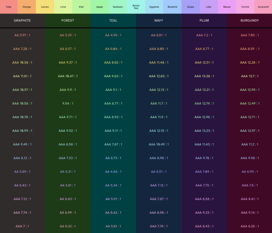
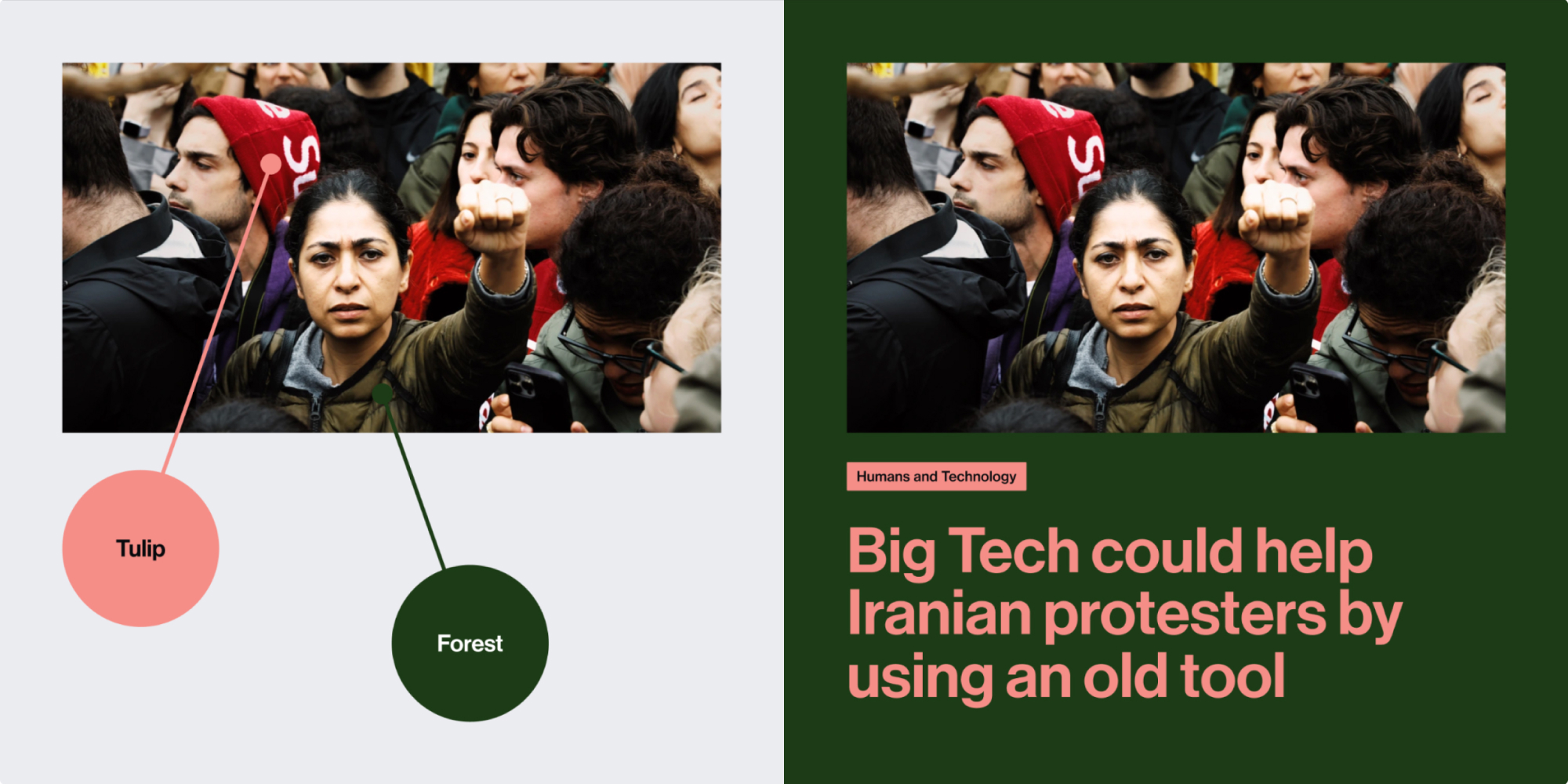
We introduced a modular palette with over 100 accessible color combinations, making bold layouts easy yet safe.
Highlights
Chalky and bright, reserved for text and visual accents.
Tones
Rich and subtle, used as a background element to unite large groups of content.

Combinations
By keeping highlights and tones separate, literally every color combo could be pleasing yet accessible, even if picked at random.
Guidelines
We didn't want to force a single look or feel. Color combos could be quirky and cheerful or sober and reserved.
For engineering handoff, we created a Figma library that codified designs down to the atomic level.
Framework
Atomic elements used to build sitewide componentry. Think eyebrows, lists, breadcrumbs, etc.
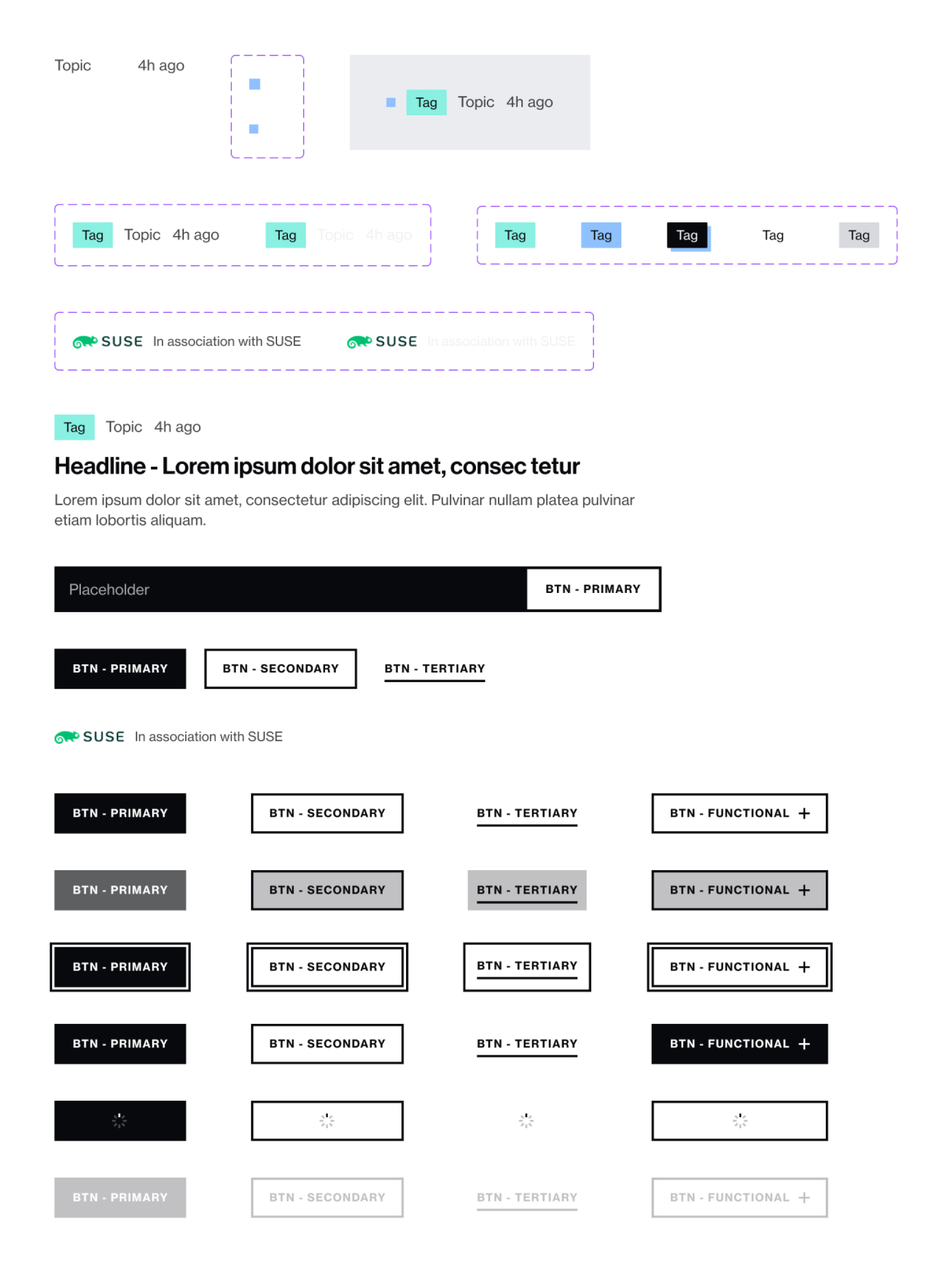
Modules
Semantically distinct Lego bricks of content. Built with atomic components but allowing flexibility for unique elements.
Layouts
Page-wide compositions of modules that stack veritcally. Easy to create lots of variants without breaking the page.
Pages
Final designs composed of multiple layouts stacked together.
©2024 Patrick Delaney - Made in Kentucky